Showing posts with label Overview. Show all posts

Thursday, March 16, 2017

CCP Its Time - Structure Changes for the Overview

I really really like a lot of things about the new structures (i.e. Citadels and Engineering Complexes).

I feel that these items have opened up space customization and player housing in a way that Player Owned Stations and Outposts failed to do adequately. The latter came closer for sure, but the limitations (only certain null sec, only one per system) put them out of range of a large portion of the playerbase, and the former, while available to all areas of space, are just awkward to own, utilize, and share.

Upwell structures combine the best of both worlds: something you can dock in, live in, deploy anywhere (even more so than POSes), and easily share with anyone. They have quickly become ubiquitous across space giving small groups to massive alliances a place to call home.

However, there is a dark side to this propagation: Overview Glut.


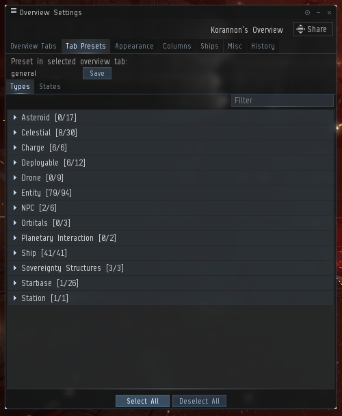
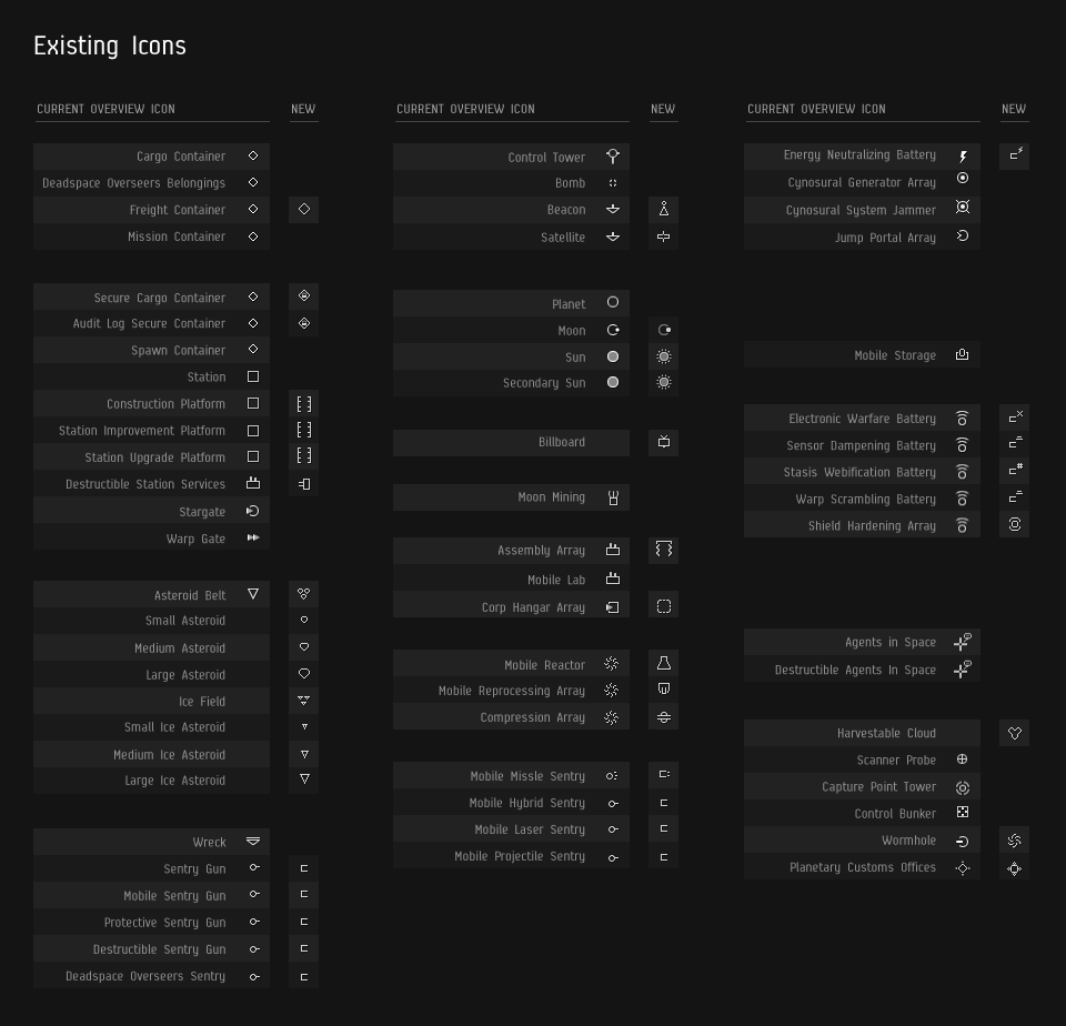
Look at the image above. Prior to Citadels, there were two dockable celestials on my overview. Upwell structures appear on the overview if you have permission to dock at them OR you are on the same space grid with them. But in both cases they look on the same on the overview so you can get into the situation where two structures are on the overview and one you can dock at and one you can't and you need to look at the name and know which is which or you need to warp to each one and see what happens.

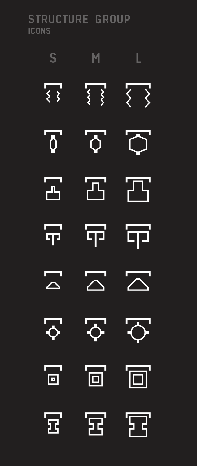
On top of that, even if every structure on the overview are ones you have access to, there is no easy way to distinguish at a glace or with a tab preset any of them of the same size in any manner except reading the names. For example, look again at the image above and find the Astrahus owned by my corporation Aideron Robotics. While its easy to distinguish the Azbel and Fortizar from the Raitaru and Astrahuses, one needs to scan every one of the former and know the name to find the Kirith's Grand Emproium Astrahus. And to complicate matters every structure automatically gets the system name pre-pended so you can't even scan the column's first letter/word easily. There has to be a better way.

I have several proposals.

1. Apply corporate standings tags to structures just like we do to pilots in the overview. This would quickly distinguish corporate structures from alliance structure from friendly structures from neutral and hostile ones. Yes, this does not mean you have access to docking at that structure but it would simply looking at a glance on the overview. And besides, someone blue on the overview doesn't mean that they won't shoot you either.

2. Indicate accessibility in a new column. Either a new overlay icon on the regular icon (like a tiny green check mark) or a new column (with check mark). This would be an optional column and could be placed anywhere is the column order.

3. Grey out structures not accessible when on grid with them. Yes, you can see them and everything, but some sort of indication that they are not accessible would simplify life immensely.

4. Provide option to see ALL structures in overview. Right now you jump into a system there is a second you see all structures before the ones you don't have access too and are not on grid get greyed out and removed from overview. It would be nice for scouting purposes (and home defense) to be able to bring them up.

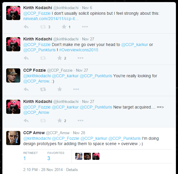
CCP its time - make the overview great again!

Thursday, July 23, 2015

Short Overview Exploration Part 2 - Brackets

Earlier this week I had a post explaining parts of the overview and commenter Rob Kaichin responded:
Any chance of an explanation on brackets? They're the main fustration and mystery to me, especially when I'm flying logi. Can't see who I need to see without showing them all, and can't remove the ones I don't want without not showing them all. Similarly with moons in space, how do I get the brackets to show up?
*tears his hair out*
You're my only hope.
 I'll see what I can do, but I'm a little concerned I don't understand his request, or we are mixing up terminology here.

What CCP calls "brackets" merely refers to the icons of stuff in space. I don't know why they are called brackets, possibly an early version of EVE they were square brackets around an objects location and the term stuck, much like how CCP calls the space where missions take place dungeons.

If you're flying Logistics and doing repairs on fleet members during combat, brackets in space should be your LAST concern, you should be working off your watch list for smaller groups or broadcast history for larger groups.

But if you are trying to get celestial objects to show up without having them appear in the overview, well, then I think I can help.

Tabs 

We talked last time how the overview can have up to 5 tabs setup with each tab having its own rules for which objects appear in the overview based on their Type and pilot State.
Types tab
You make your selections for the rules to determine when something shows up in the overview for the tab and save it, in the image above we called it "general" for my all purpose see-most-things tab.

On the main tab before "Tab Presets" is the "Overview Tabs" tab. On that page you set up the five tabs with names and the specific "preset" to use in the first two columns:

The third column is used to decide which Preset rules to use for figuring out which icons (or brackets) to show on the objects in space. There is a "Show All Brackets" option in which all objects in space that can be seen will have their bracket show whether or not the current tab shows them in the overview.

In my overview I have two tabs, one called "Default" set to preset "general" which shows most things, and a second called "travel" set to preset "warpto" which shows only things like gates, planets, etc.

Here what it looks like in space on my current Default tab:
general preset, show all brackets

In space you can see all brackets, so icons for things like billboards and sentry guns that I have turned off in my "general" preset. If I change to my "travel" tab:

warpto preset, show all brackets
My icons in space have not changed because it still shows all brackets but my overview is simplified.

Now if I go back to my "Default" tab and change the Bracket Preset to "warpto" we see this:
general preset, warpto brackets
We see the overview itself shows what I expect from the selections in "general" presets, but in space I see very little as it applies the limited selection of "warpto" preset. Conversely, switching them in the "travel" tab we get the opposite:
warpto preset, general brackets
We see a limited selection in the overview, but a larger selection in space.

And that is how you control brackets in the overview. Its worth noting that there are short cut key strokes to toggle turning on or off all brackets:

To be honest, I don't know what "Toggle Special Bracket Display" means.

And that's the scoop on Brackets.

Tuesday, July 21, 2015

Short Overview Exploration

Over at High Drag podcast Random McNally was complaining that he didn't understand anything in the overview settings and how it worked. I'm going to take a short post to explain some of the most complicated tabs in the settings.

Tab Presets - Types

You can have up to 5 tabs in your overview and what is displayed in each can be different, but the appearance of what is displayed has to be the same. In the Tab Presents tab, you control what things are displayed per tab.

In the image below, you can see me looking at the Types tab for my "general" overview tab.

These are straight forward on/off check boxes where you select the things you want to see. Often when a new ship or deployable object is added to the game by CCP, you have to come here and make sure it is checked or you won't see it in space on your overview.

Tab Presets - States

Things get a little trickier in the States tab of Tab Presets.


There are many states which are not mutually exclusive  that an object or pilot in space can have in relation to you. For example a pilot can be a criminal, in your militia, at war with your corporation/alliance, have a bounty, and a security station below 0. This tab allows you to control whether or not they show up in your overview at all, but not what they will looks like if there (that's governed by the Appearance tab and we will get there).

There are three options for a state:

Always Show - it will appear regardless of any other state it may have
Filter Out - it will not appear unless it also has a state which is set to Always Show
Show By Default - it will appear as long as it does not have a state which is set to Filter Out


This tab is useful for setting up overview tabs where you don't want to see "friendlies" in the overview so you only open fire on enemy ships, or the inverse if you are a logi pilot. Again, it does impact how the items will appear in the overview, only whether they are seen or not.

Appearance - Color Tag

The Appearance tab affects all tabs in your overview and allows you to tailor how an item in the overview is displayed assuming it was not filtered out by its Type or State in the Tab Presents rules.

The colortag is the little icon that gets attached to the overview icon in the overview and in space. Most familiar is the green and white icon for pilots in your corporation.


This is where things can get confusing. Let's say you are in space and a pilot arrives on grid with you who is in your militia, has terrible standing, and is a criminal. Which icon will he sport?

EVE figures it out by working down the list from the top and using the first matching one. This is the source of most "overview malfunctions" in Faction Warfare where a lot of pilots are a criminal from shooting neutral parties but are in your militia so should not be shot. This is addressed in this tab by dragging the "Pilot is in your militia" higher in the list above the "Pilot is a criminal".

Generally speaking, you want "Pilot is in your fleet" / corporation / alliance / militia to be highest on the list, followed by pilots at war and terrible / bad standing.

Appearance - Background 

The Background tab of the Appearance Tab is basically the exact same mechanism except its logic is for the background colour the row in the overview receives.


It has the same mechanic for picking the background (i.e. work down the list until it finds the first matching rule) and the same drag and drop for picking the priority.

The neat thing is that you can combine the tag and the background logic to do powerful things. For example, what I've done on my overview is have the colortag set show terrible standing higher than "Pilot is a criminal" or suspect or security status below -5, and the background has those higher. This way I can see on my overview easily neutrals I have bad standing with because I suspect they will attack, but also quickly tell at a glance when on grid whether or not I can engage them without getting sentry gun fire because their background flashes red. Prevents me from engaging neutrals with bad standing but high sec status and no criminal timer (usually).

That's it! There is my quick explanation of the overview setting's most confusing tabs.

Friday, February 27, 2015

At Long Last - Overview Moderization

One of my pet peeves with the EVE UI has been the overview icons. I first brought it up in October of 2010 when I suggested a more refined ship icon classification system:

Then a few short months later in March of 2011 it seemed as if CCP was listening to me and we saw these icons on SISI for a short build:

Imagine my excitement! But alas, it did not remain and soon we were back to the horrible squares.

After three and a half years of waiting I got back on my soapbox and pleaded with CCP to do something with the overview:

I took to twitter to pester some devs and got this reply from CCP Arrow:


So there was hope! And at long last, CCP Arrow delivered in a Dev blog yesterday title UI Modernization - Icon Strategy:
Fellow capsuleers,
EVE developers have been quite busy in the past few weeks working on gameplay features, which is good because that‘s what they are supposed to do! But concurrently, various members of these teams have also been working on a cross-disciplinary project called EVE UI Modernization.
Our latest efforts in this project is to deliver on a promise we identified as one of the principles of the EVE UI: a holistic icon strategy where we make all things in EVE that have a uniquely defined role, function or purpose have their own distinctive icon. This plan needs to be taken in steps because it covers pretty much everything in our client, from item icons to UI icons and will take time to fulfill. The long term goal is that in the foreseeable future we will no longer see the same item icon for two different modules or other things. For now however, we are starting with UI icons only and the first thing we want to tackle is icons displayed in the Overview and in-space environment.
What I was hoping for was a simply a rework of the ship icons to convey more information to a pilot at a glance. What CCP Arrow and his compatriots delivered was a conprehensive overhaul of how things appear in space. For example:


To say I was floored as well as extremely happy would be an understatement. I have some minor concerns about the ship icons and how easy it will be to distinguish them on the overview when all is said and done, but I like the direction and the desired outcome. 

I look forward to seeing it in game. Good work CCP Arrow!

Thursday, December 18, 2014

CCP Its Time - Overview Overhaul

As a solo pilot or a fleet line member, or even as a scout, I came to appreciate and accept the overview's functions and limitations. When you are only concerned with yourself and your targets, for the most part, the overview suffices in what it offers.

But as a Fleet Commander with tens of pilots under my control, I am starting to really find the overview lacking in its functionality. Well, that's not completely correct. I can make the overview do what I want it to in various configurations, for example, show me all hostiles sorted by range or show me drones or show me all ships on grid grouped by type, etc. But what I want, what I really really want, is the ability to have multiple overviews open at once.

Here's what I'd like to be able to do:

Main overview: showing hostile ships only, sorted by type, and filtered further by a range of 0-75km. Second tab shows all ships with same sort and filter. Perhaps a third tab of hostiles but further filters to 0-30km.
Second overview: showing hostile ships only, sorted by type, and filtered to 75+km. Second tab shows all ships with same sort and filter.

When I'm FCing, there is the immediate threat of ships right on top of our fleet, and the secondary threat of ships on grid near our fleet. The tertiary threat of ships in system or on the other side of the gate are handled through normal intel. 

As I go to call targets (or decide to GTFO), I need to see what enemy ships are close and what types there are present on the grid but out of the immediate threat zone. An Ashimmu that's close to me is less of a concern than one 30 km away but on top of our logi. A Blackbird anywhere on the grid is a concern. Enemy logi is a target unless they are too far from targets I want to engage, etc.

The current overview is good at answering some of those questions one at a time, but lacks in allowing me to answer all of them quickly or even at once. I want multiple overviews.

* * * * *

OK, reality check time. 

The likelihood of getting multiple overviews that can be sorted and filtered like I want is very low, but perhaps its time to look at enhancing the current overview. At least being able to add a range filter to the distance would give some of the functionality I desire, especially if it was set per tab. As discussed in previous posts, I also think a lot more information could be graphically delivered such as hull size and role if you changed the overview icons for ships to something more intuitive. Velocities could have a gradient of colour based on how high they are. Distance could be done with colour or icons or even font size/boldness or transparency (e.g. bold and solid for close items, faint and translucent for distant). 

I'm just spitballing here but I really think it time to increase the power and information radiation levels of the overview. Aspiring FCs will love you for it, CCP.

Saturday, February 15, 2014

See All The Things

Immediate panic rose in my gut when I saw on Twitter some devs talking about the Overview. One wrong move, I thought, and they could break the whole game.

* * * * *

As an EVE pilot, I have a love-hate relationship with the overview. On one hand, I hate how it looks and how much screen space it can take up on my monitor, all spreadsheet-y and wide as I try and fit three different types of velocities on it.... what's that? Yes, three. The base velocity which tells me how fast the target is going so I know I or anyone else has a chance to catch it, the transversal velocity to give me an idea if my weapons can track it, and the radial velocity which is a measure of how fast they are moving away or towards me as if I was stationary which is useful for seeing when a target is approaching (and how fast) or running away. I also have the militia column so I can keep an eye out for Minmatar Militia awoxers, and the usual Name, description, and distance.

But while it takes up a lot of space, I love how much information it gives me at a glance. Distance, speed, name, type, whether they are a pirate or suspect or ally... an experienced pilot can look at an overview and in a split second know whether or not he is in position or in trouble.

It is the universal tool; every pilot has one, uses it (sometimes incorrectly), and needs it. There is no other option.

And then I started leading fleets.

As a line pilot in a fight, the FC calls the primary and I attack the primary while locking up nearby secondaries. My spatial awareness doesn't need to be very high. As a tackle pilot in a fleet or a solo pilot, I needed more spatial awareness to know which targets to burn for, which direction to burn off, how to slingshot opponents to catch them or get away, but it was all "where am I in relation to everything else" so I didn't need to pay too much attention to everything, just my general orientation and vector.

But as the FC, you need to know even more. The spatial orientation of your fleet including the tacklers, DPS ships, Logistics, and even your EWAR. Then you need to know where your enemy is and what they are flying and doing. The overview alone is not enough and that's why I've started flying zoomed way out with the range view turned on like so:
Click for full size.
In a battle with my fleet of ~20 or more against a hostile fleet I have that zoomed out as far as necessary to see everything happening on the grid, sometimes up to more than 100 km radius. This view, combined with the information in the overview, gives me the on grid information I need to make appropriate decisions.

How Can It Be Better?

That's the million ISK question, isn't it? Some ideas recently thrown around involve having the overview somewhere else: undocked into its own window so it can live on another monitor, or streamed to a mobile device... but these two ideas involve moving he overview away from where I need it most! So I'm not a fan.

Another idea was to suggest we could have more than 5 tabs and that multiple overview windows could exist, giving the possibility of seeing multiple views on the current environment at once. I can see some possibilities with these concepts but doesn't really address the amount of screenspace the overview requires for me.

I've seen some suggestions that more information could be moved out of the overview and to the sceen itself, perhaps things like velocity and type could be attached to the ship icon. However, this idea quickly falls down for me when we start having more than ten ships on the grid and all that information gets harder and harder to see and process.

But there are some things we could do to improve information visibility in the main view. I've suggested multiple times in the past (and CCP even tried it on SISI once) that the icons need to be updated to give more information at a glance than they do now, so you can tell a destroyer from a cruiser or battlecruiser on the grid with looking up the type, or a battleship from a titan. Furthermore, colours of the icons could be used to indicate a number of things from velocity to damage taken. Right now the icons show rough ship types (small, medium, large, industrial) and that's it. Using the icon could free information from the spreadsheet overview and put it on the field without cluttering the view.

I also think that more customization to the tooltip of hovering over an icon in space would be valuable. Right now you can hack in upgrades to your Targeting HUD but it would be nice for CCP to formalize that functionality and improve it.

Overall I think a few small changes like that could go far into giving pilots and fleet commanders more information at a glance without cluttering the display beyond usefulness.

Wednesday, December 07, 2011

Enhanced Targeting HUD

Seeing my PvP videos of my fights with Stan, a couple people asked about how I got the enhanced green multiline text to show on my currently selected item. Here is an example:
From BMTHOKK 2
Well, the answer is that a while back there was a pilot who put together an Overview Creator that allowed you to setup your overview through a friendly interface and export an XML file you could then import into Eve. Part of this website's functionality was the ability to customize your selection text into very fancy outputs like the one you see above.

Alas, that website has gone down (was balss-industries.com) and I've emailed the creator to find out if it can be brought back to life. No word yet.

But if you feel adventurous, you can hand craft it. Here's how:

1) In game, right click on your Overview tab and choose to export overview. This creates an XML file in your "My Documents\Eve\overview" folder (or corresponding folder on your machine).

2) Using a nice XML editor program, (or notepad but that is hardcore) you can change the file in the section called "shiplabels" to show something like this:

Note that the xml is actually cleaned up by my xml editor from this in the plain text version of the XML:

Note that the last one is Distance with a type of "None" because the client automatically puts the distance at the end of the ship labels I believe.

In theory you could get creative and have multiple colours, font sizes and effects, or other information important to you. If you decide to try this out, please export your current overview and save it safely somewhere as a backup.

Note: as far as I know, this is not considered an exploit by CCP according to the Overview Creator website that advertised on the forums while it was in operation.

FOLLOW UP:
I made a petition to CCP and here is the response:
Hello Kirith,

While we do not currently consider this to be a violation of the EULA, please note that we do reserve the right to change this decision at a point in the future should we find it necessary. If you have any other questions or problems, please let me know.

Best regards,
GM
EVE Online Customer Support Team