Then a few short months later in March of 2011 it seemed as if CCP was listening to me and we saw these icons on SISI for a short build:

Imagine my excitement! But alas, it did not remain and soon we were back to the horrible squares.
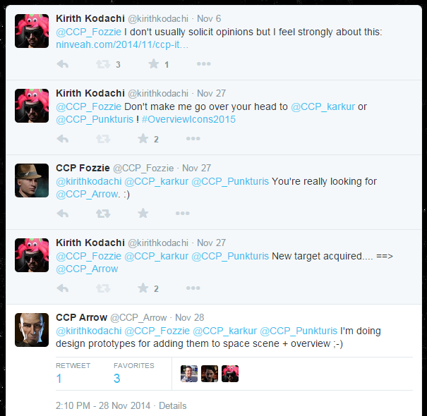
After three and a half years of waiting I got back on my soapbox and pleaded with CCP to do something with the overview:
I took to twitter to pester some devs and got this reply from CCP Arrow:
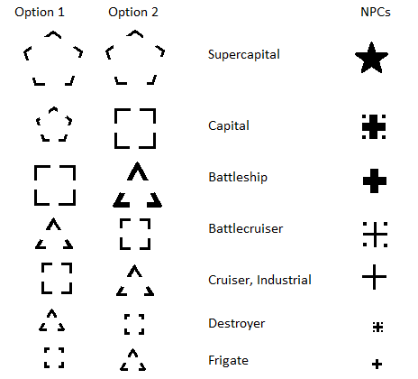
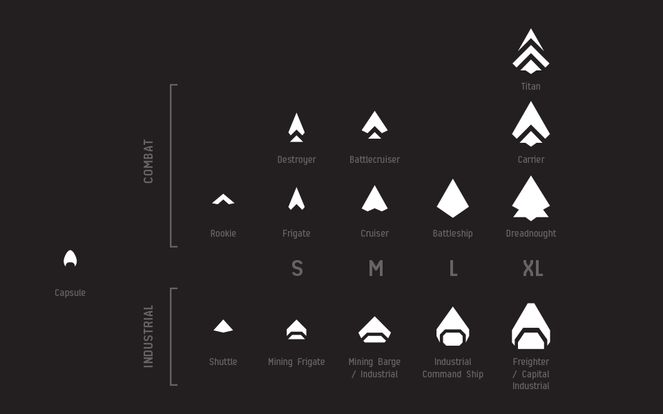
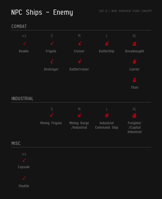
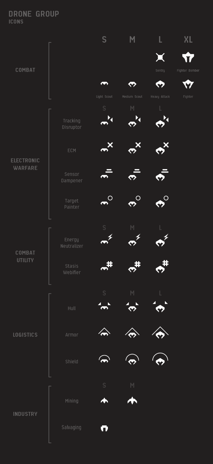
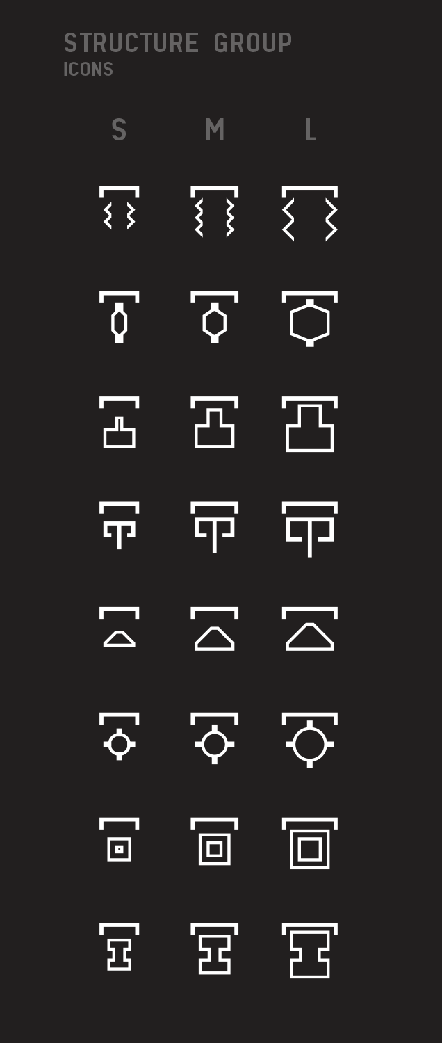
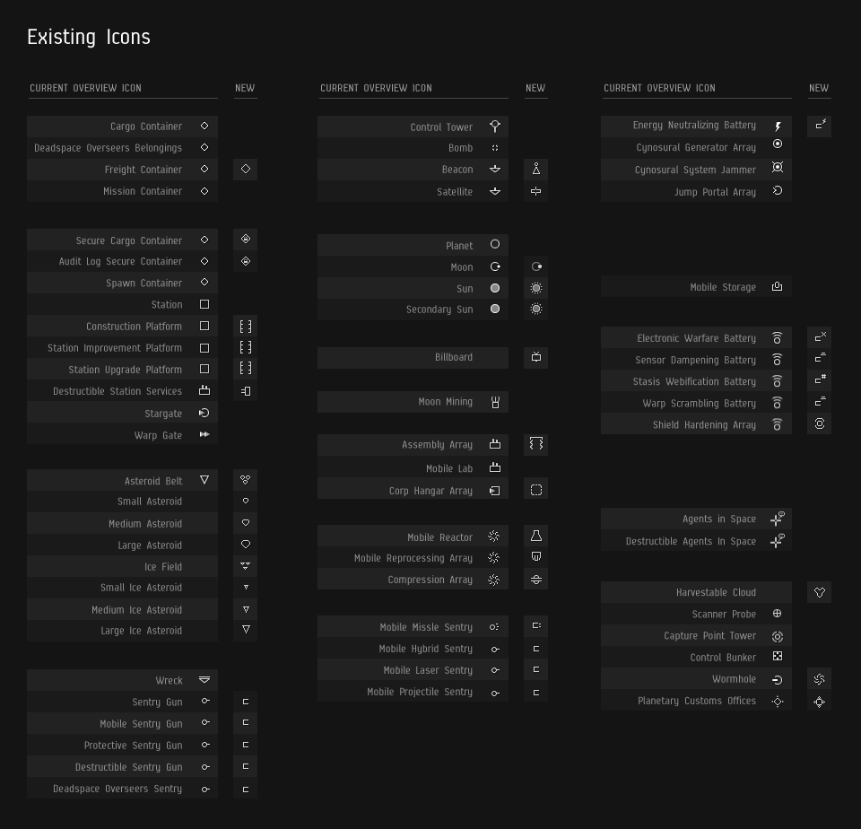
Fellow capsuleers,What I was hoping for was a simply a rework of the ship icons to convey more information to a pilot at a glance. What CCP Arrow and his compatriots delivered was a conprehensive overhaul of how things appear in space. For example:
EVE developers have been quite busy in the past few weeks working on gameplay features, which is good because that‘s what they are supposed to do! But concurrently, various members of these teams have also been working on a cross-disciplinary project called EVE UI Modernization.
Our latest efforts in this project is to deliver on a promise we identified as one of the principles of the EVE UI: a holistic icon strategy where we make all things in EVE that have a uniquely defined role, function or purpose have their own distinctive icon. This plan needs to be taken in steps because it covers pretty much everything in our client, from item icons to UI icons and will take time to fulfill. The long term goal is that in the foreseeable future we will no longer see the same item icon for two different modules or other things. For now however, we are starting with UI icons only and the first thing we want to tackle is icons displayed in the Overview and in-space environment.
To say I was floored as well as extremely happy would be an understatement. I have some minor concerns about the ship icons and how easy it will be to distinguish them on the overview when all is said and done, but I like the direction and the desired outcome.
I look forward to seeing it in game. Good work CCP Arrow!


It's gone from one extreme to the other.
ReplyDeleteWill take some getting used to but in a month or so we'll be used to them.
ReplyDeleteWill we still talk about shooting red crosses in the future?
I already blamed you in another post about this subject.