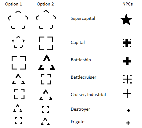
There is one thing that bugs me about the overview. We have 7 classes of ship sizes (frigate, destroyer, cruiser, battlecruiser, battleship, capital, and supercapital) and 3 sizes of icons to fit them all into such that Titans use the same icon as battleships.(Yes, I know there is a rectangle for industrials even back then, I made a slight mistake.)
(Please excuse my sad MS Paint skills.) The overview has more ability than that and we should encourage, nay DEMAND, that CCP address this deficit. ;-)
In order to be constructive, I have a proposal for new icon classifications.
As you can see, I propose using triangles to mix with the squares for sub capitals, and pentagons for capital and super capitals. For NPCs, perhaps something more subtle.
This small change will allow pilots to quickly pick out the various ship classes faster at a glance rather than having to add the ship type column and scan through it all the time.

Then, for one brief moment in March of 2011 I was on Singularity server and was so happy to see this in a post called CCP, Send My Cheque to 123 Hell Yeah!:
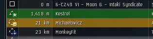
Today I had 15 minutes free so I logged into Sisi to fool around with the player character and check out any changes and I was shocked to be presented with new icons in the overview:

Sadly, the changes didn't last for very long and were reverted back to the archaic four white boxes we still have today, despite the vast number of graphical improvements since then. This is a huge shame since the problem of the old icons has only gotten worse since then.
Their is a unique icon for capital (same one for the Wyvern FYI), battleship, cruiser/battlecruiser, and I dropped a kestrel from my hanger to see the new one for frigate. The effect is that you can immediately tell there is different hull types on the field at a glance without having to compare pixels on squares.
I approve.
Consider what ship tiericide has done to the meta of PvP. Back in 2010 you probably needed to worry about the names and abilities of a handful of ships that were used and all others were curiosities piloted by newbies. Osprey? Bellicose? Breacher? Inquisitor? But with the removal of ship tiers and introduction of ship roles and constant ship balancing, not to mention the addition of more ships (Tech 3 cruisers, Attack Battlecruisers, mining frigates, and soon Tech 3 destroyers) to amount of information about ship hulls has increased dramatically while the limited information about ship hulls has remained pathetically small.
I don't think its no longer enough that the overview is changed to more accurately indicate ship hull size, I think we need to consider what can be done to change the icons to show at a glance ship hull size and role.
Here's a quick example chart to demonstrate what I mean:
| General | Attack | Combat | Support | Disruption | Industrial | |
| Shuttle | o | |||||
| Frigate | f | x | s | d | m | |
| Destroyer | d | |||||
| Cruiser | F | X | S | D | M | |
| Battlecruiser | [F] | [X] | ||||
| Battleship | [[F]] | [[X]] | [[D]] | [M] | ||
| Capital | [[C]] | [[M]] | ||||
| Supercapital | [[[SC]]] |
Instead of four icons, there are 22 in this scheme I whipped up in two minutes which still ignores Tech 3 and faction ships which might consider some thought as well. Obviously substitute appropriate icons for the textual representations I used. The goal is that instead of memorizing hundreds of ship names and their associated sizes and hulls, a pilot can infer a ship's size and role by memorizing a handful of icons, or even have them printed out beside the keyboard for a quick lookup. This is especially important for new players getting into PvP who are facing an array of ships obfuscated by three squares and a rectangle.
This is one of those times complexity would be a good idea in order to improve accessibility. Its four years overdue CCP, and it hurts your game. Fix it.


Did you take a look at the icons in the ISIS system? I like those.
ReplyDeleteYes, a couple corpmates suggested those as well.
DeleteMy only concern being how to incorporate hull size as well as role type.
DeleteOh yes please .. any real live radar screen has more icons ... It is so much more complicated with only the few icons .. and please add also different icons for different drones ...
ReplyDelete