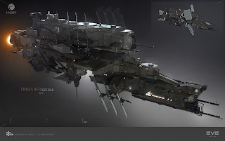
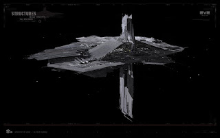
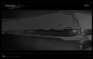
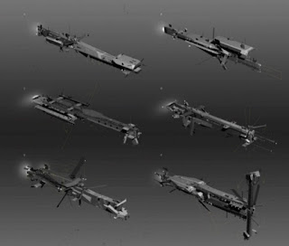
The art team has been working on many art assets recently and there has been talk of the "Caldarification" of Eve related art. Recently examples have been the WIP images of the Thrasher class destroyer redesign and the citadel. Do we need to keep the lines between the races designs clear cut or is some blending of more generic sci-fi styling a good thing? Should Matari be flying/floating scrap heaps? Should Gallente be 'all about the bass'? Or is a bit of generic sci-fi styling needed to bring new life to our important internet spaceships even if it leans a bit to Caldari?Let's take a look at examples of these WIP images:
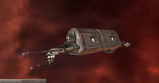
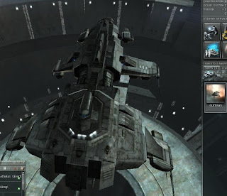
Yes, the aesthetic of the models does seem to invoke a lot of the designs of Caldari ships and structures, especially when viewed without colour as in these images. The Thrasher in particular could be a mutant brother of the Jackdaw Tactical Destroyer:
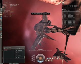
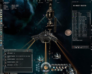
Excepting the Badger, every ship in those images are asymmetric. There were some mostly symmetric ships in the Caldari line when I started, like the Merlin and Caracal, but they were the exceptions. Over the years and redesigns that started to go away from all the empire's lines, replaced with a more generally pleasing symmetric look to new ships.
Another thing to not is how plain the ships look on their skins. Not a lot of shadows, tones, spikes, lights, moving parts, etc. They still looked very sci-fi but also a little plain compared to the gorgeousness we see in game now.
Let me get to the point I'm trying to make: EVE's overall look for ships has changed over the years from many asymmetric designs to symmetric ones. In addition, the capabilities of the graphics over the past decade have advanced so that the designers can be more imaginative on smaller scales to differentiate the empires, and as the artists get these new abilities their designs change and grow in new directions.
Looking at WIP images tend to look like Caldari right from the start because Caldari over-arching design concept leans heavily on the blue-gray spectrum, but I bet that once the Thrasher gets its multiple layers of shading and skin it will no longer evoke the Caldari aesthetic.
Finally, its not unusual that in a galaxy getting more and more connected via internal social changes (i.e. rise of the casuleers) and pushed together via external threats (Drifters, Sansha, Rogue Drones) that technology would coalesce as well and more overlapping in designs could evolve from that.
And I for one, welcome our Caldari engineer overlords. :)




I'm frankly glad that they fired the guy who designed the left side of Caldari ships, though now the guy who did the right side complains that he has twice as much work. Or maybe I have that backwards. Anyway, the lore has it that these two never met.
ReplyDeleteAs mentioned on twitter: I think it has a lot more to do with CCP wanting the design of the ship reflect it's intended use. That started with the Venture. For the first time we got a mining ship that looks like it is designed to break apart asteroids. The Hulk and the other barges looks like a racing cars built for speed. This new design philosophy has continued with the SOE ships and the redesigns of older ships. They even changed the SOE battleship to be able to keep a shuttle onboard because the design has it, didn't they? The Rook looks like a hitech ewar ship, because that is what it is. I for one welcome the new design philosphy :)
ReplyDelete